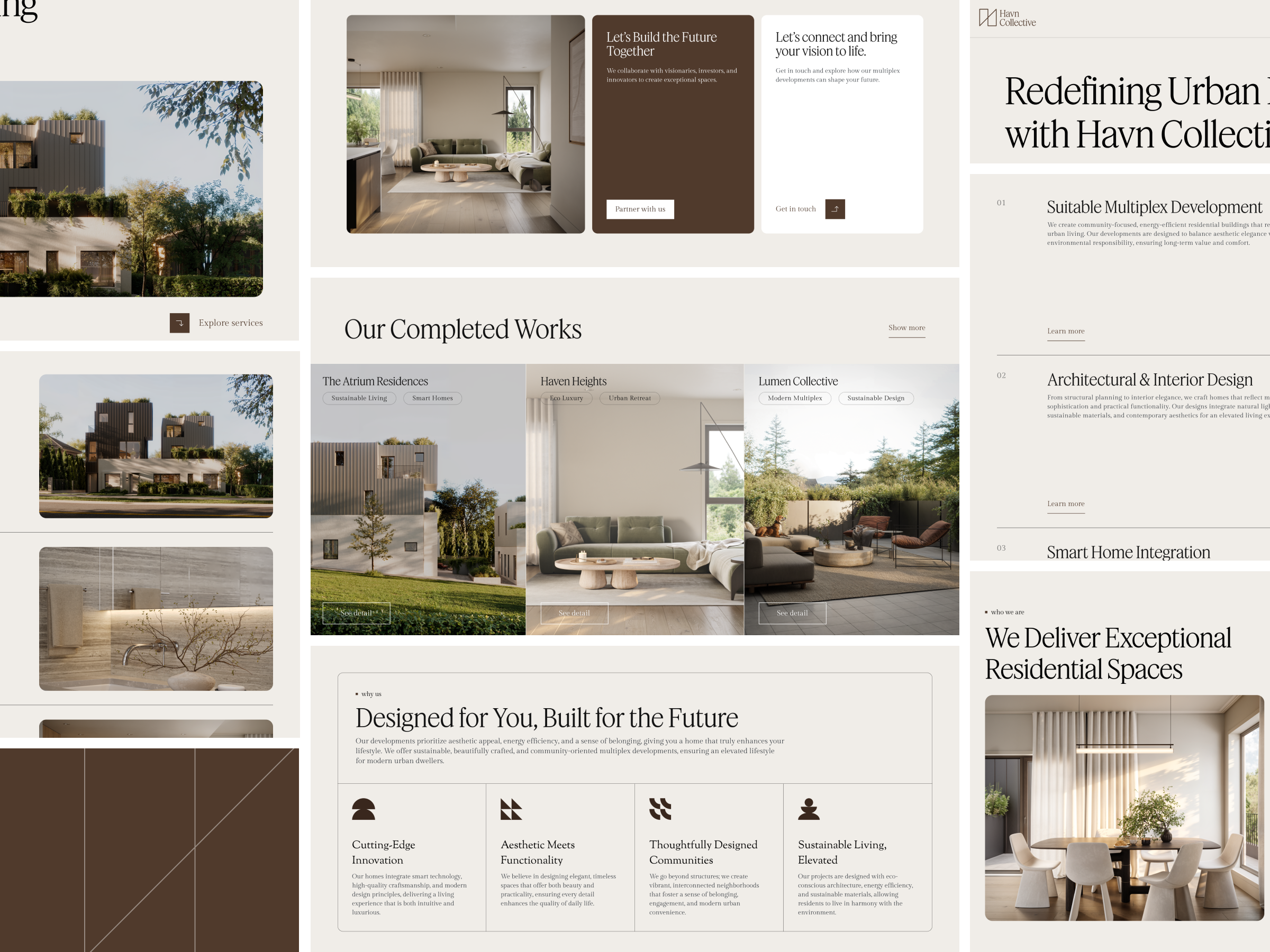
Design Approach
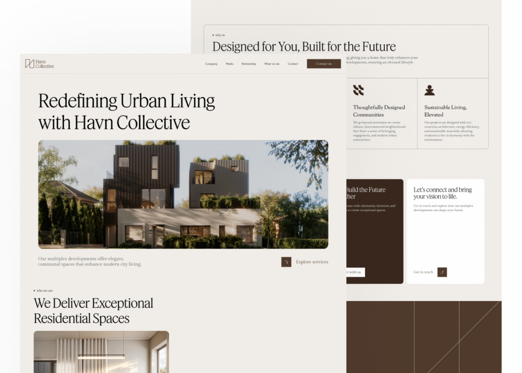
I’ll try to explain the design approach. The UI was put together to feel clear, classy, and reliable, using a nice mix of fonts, colors, and layouts. Soft beige shades, plenty of breathing room, and smooth serif fonts give it a calm, upscale feel that fits a high-end residential vibe. Everything, from the navigation to the call-to-action buttons, was made consistent and easy to follow, guiding users smoothly through the site.
I put extra love into the visual storytelling, using big images, gentle transitions, and neat card layouts to make the content pop. With flexible grids and modular sections, it looks sharp on any device. From spotlighting services to adding testimonial badges, every bit of the design builds trust and keeps things clear and professional, making every click both pretty and useful!