
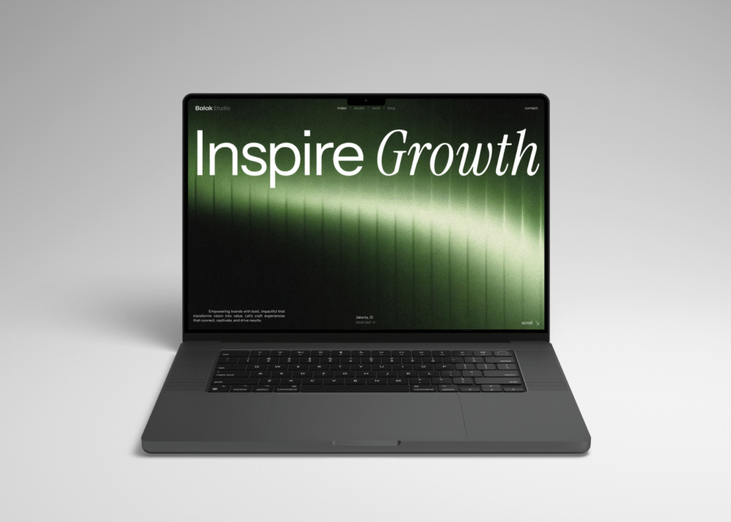
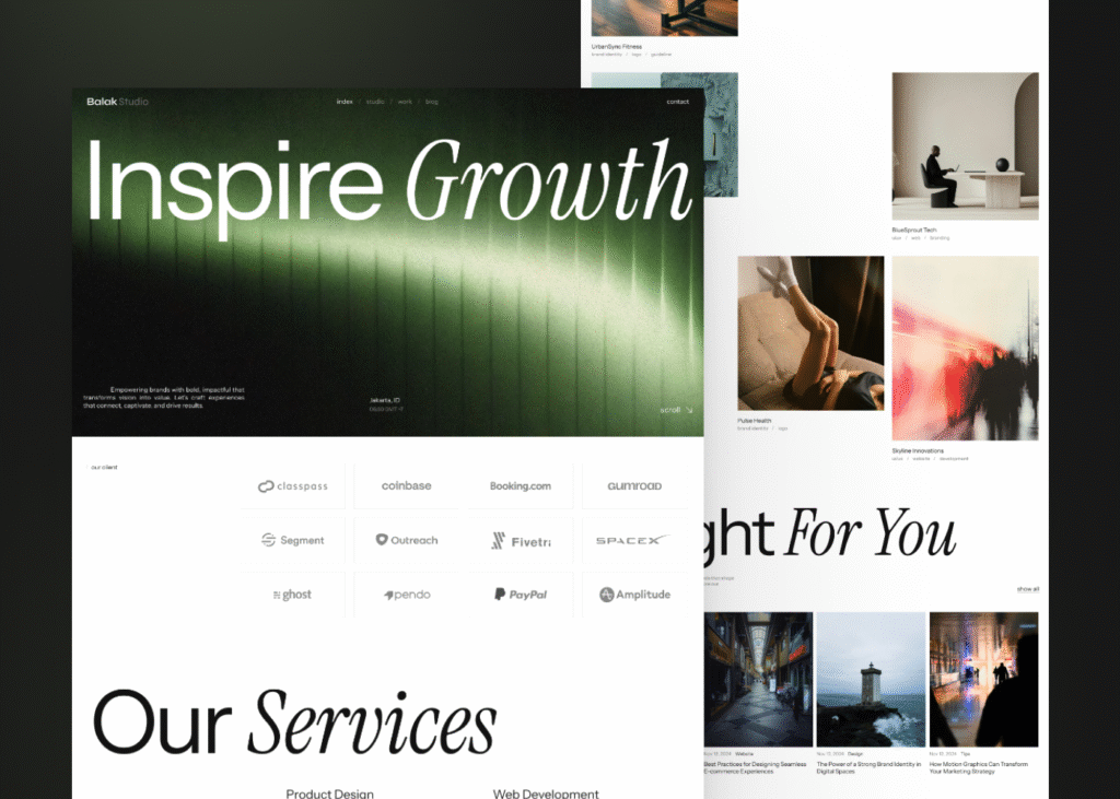
Design Concept
In this project, we chose a design style that is clean, minimalist, and modern, focusing on key aspects such as clarity and ease of navigation. I applied a clean and minimalist design approach because it aligns with my expertise and experience. Additionally, we used a monochrome color palette and easily readable typography to enhance the overall design.
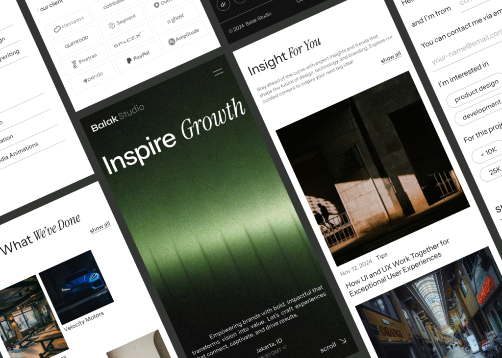
Mobile Version
Building the minimalist and bold design into a responsive mobile view presents its own set of challenges. The main difficulty is balancing simplicity with impactful design on smaller screens. Elements such as bold typography and animations need to be carefully scaled down to avoid mess up while still maintaining the identity of the website.
Thank you for taking the time 🔥🤩